设计规范v1.0.0
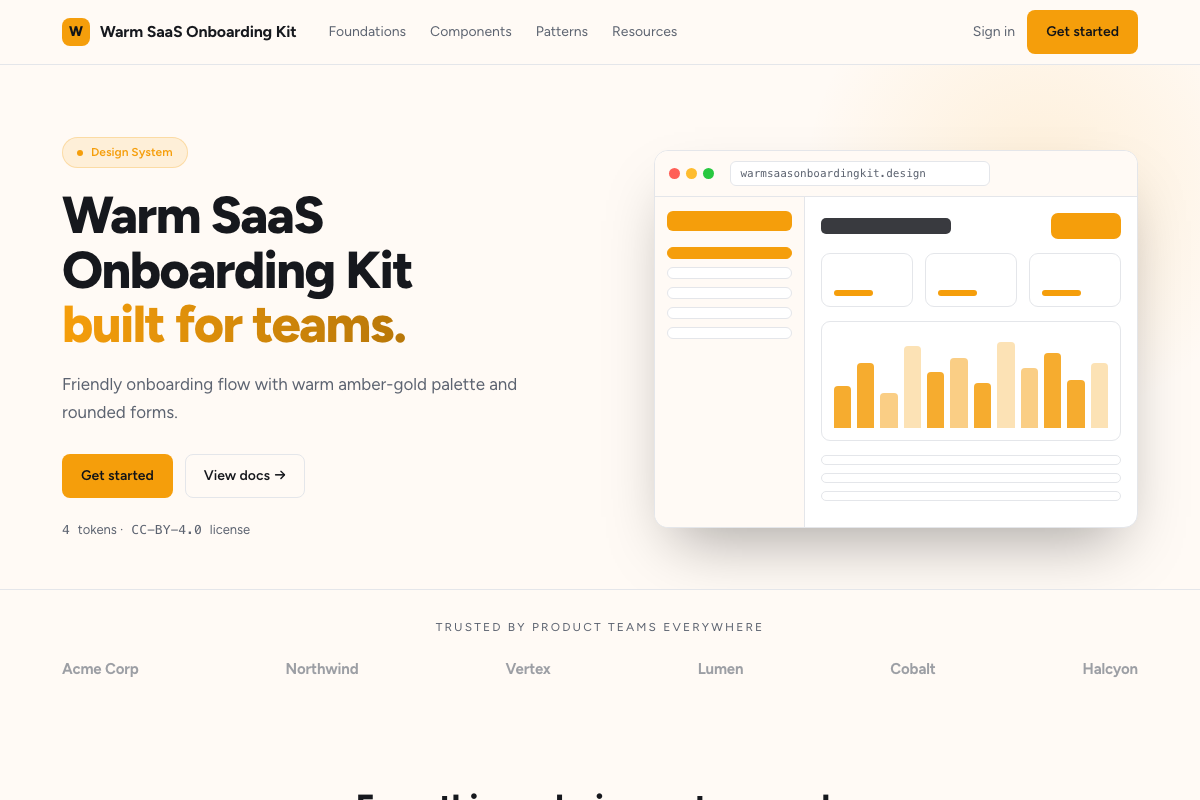
暖心 SaaS 引导页套件
SaaS 引导流程、设置向导和渐进式资料填写。
DESIGN.md
---
name: Warm SaaS Onboarding
colors:
  background: '#fffaf5'
  surface: '#ffffff'
  primary: '#f59e0b'
  primary-hover: '#d97706'
  text-primary: '#1c1917'
  text-secondary: '#78716c'
  border: '#e7d7c4'
  success: '#10b981'
typography:
  heading:
    fontFamily: Figtree
    fontSize: 26px
    fontWeight: '700'
  body:
    fontFamily: Figtree
    fontSize: 16px
    lineHeight: '1.7'
  label:
    fontFamily: Figtree
    fontSize: 14px
    fontWeight: '500'
rounded:
  DEFAULT: 12px
  input: 10px
spacing:
  base: 4px
---

## Overview

Warm, approachable aesthetic for onboarding flows. Cream
backgrounds, amber-gold primary actions, generous rounded corners,
and friendly Figtree typography make setup wizards feel inviting
rather than bureaucratic.

## Colors

- Background: warm cream (#fffaf5)
- Surface: pure white cards on cream base
- Primary: golden amber (#f59e0b), darker on hover (#d97706)
- Text: warm charcoal (#1c1917), muted (#78716c)
- Borders: warm tan (#e7d7c4), softer than gray

## Typography

Figtree throughout — a friendly geometric sans. Headings at 700,
body at 400 with 1.7 line-height for readability.

## Components

- Step Indicator: numbered circles connecting lines, active step filled
- Input: cream well (#fef3c7) with amber focus ring
- Button: fully rounded (12px), amber fill, white text
- Progress Bar: thin amber bar across the top
- Success Check: green checkmark with emerald background burst