设计规范v1.0
Netflix
Apply Netflix's design language to your project for a polished, brand-consistent UI.
DESIGN.md
Apply Netflix's design language to your project for a polished, brand-consistent UI.
---
version: alpha
name: Netflix-design-analysis
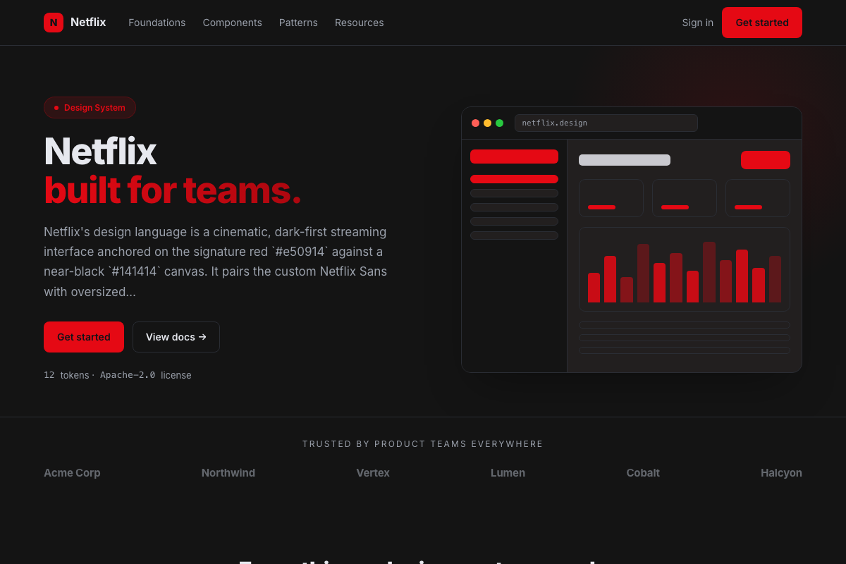
description: Netflix's design language is a cinematic, dark-first streaming interface anchored on the signature red `#e50914` against a near-black `#141414` canvas. It pairs the custom Netflix Sans with oversized display type, and uses deep blacks, subtle grays, and shadowed gradients to make artwork and video feel luminous. Surfaces are large, immersive, and arranged in horizontal rails.

colors:
  primary: "#e50914"
  primary_dark: "#b00710"
  primary_light: "#f6121d"
  canvas: "#141414"
  canvas_deeper: "#000000"
  surface: "#221f1f"
  surface_2: "#2a2a2a"
  fg_default: "#ffffff"
  fg_muted: "#8c8c8c"
  fg_faint: "#6d6d6d"
  border_default: "#2f2f2f"
  hairline: "#3a3a3a"
  accent_link: "#0071eb"
  on_primary: "#ffffff"

typography:
  display-xxl:
    fontFamily: ""Netflix Sans", "Helvetica Neue", Helvetica, Arial, sans-serif"
    fontSize: 56px
    fontWeight: 700
    lineHeight: 1.05
    letterSpacing: -1px
  display-xl:
    fontFamily: ""Netflix Sans", "Helvetica Neue", Helvetica, Arial, sans-serif"
    fontSize: 48px
    fontWeight: 700
    lineHeight: 1.1
    letterSpacing: -0.75px
  display-lg:
    fontFamily: ""Netflix Sans", "Helvetica Neue", Helvetica, Arial, sans-serif"
    fontSize: 40px
    fontWeight: 600
    lineHeight: 1.1
    letterSpacing: -0.5px
  display-md:
    fontFamily: ""Netflix Sans", "Helvetica Neue", Helvetica, Arial, sans-serif"
    fontSize: 32px
    fontWeight: 600
    lineHeight: 1.15
    letterSpacing: -0.25px
  heading-lg:
    fontFamily: ""Netflix Sans", "Helvetica Neue", Helvetica, Arial, sans-serif"
    fontSize: 24px
    fontWeight: 600
    lineHeight: 1.2
    letterSpacing: 0
  heading-md:
    fontFamily: ""Netflix Sans", "Helvetica Neue", Helvetica, Arial, sans-serif"
    fontSize: 20px
    fontWeight: 600
    lineHeight: 1.3
    letterSpacing: 0
  heading-sm:
    fontFamily: ""Netflix Sans", "Helvetica Neue", Helvetica, Arial, sans-serif"
    fontSize: 18px
    fontWeight: 600
    lineHeight: 1.4
    letterSpacing: 0
  body-lg:
    fontFamily: ""Netflix Sans", "Helvetica Neue", Helvetica, Arial, sans-serif"
    fontSize: 16px
    fontWeight: 400
    lineHeight: 1.5
    letterSpacing: 0
  body-md:
    fontFamily: ""Netflix Sans", "Helvetica Neue", Helvetica, Arial, sans-serif"
    fontSize: 15px
    fontWeight: 400
    lineHeight: 1.5
    letterSpacing: 0
  body-sm:
    fontFamily: ""Netflix Sans", "Helvetica Neue", Helvetica, Arial, sans-serif"
    fontSize: 14px
    fontWeight: 400
    lineHeight: 1.4
    letterSpacing: 0
  caption:
    fontFamily: ""Netflix Sans", "Helvetica Neue", Helvetica, Arial, sans-serif"
    fontSize: 12px
    fontWeight: 400
    lineHeight: 1.4
    letterSpacing: 0
---

# Design System Inspired by Netflix

## 1. Visual Theme & Atmosphere

Netflix is designed around the content: a near-black `#141414` stage that makes poster art and video glow. The only persistent brand color is the red `#e50914` of the wordmark and primary CTAs. Every other surface — cards, rails, menus — recedes into blacks and grays, so the artwork is always the brightest thing on screen.

## 2. Color System

- **Netflix red** `#e50914` — logo, primary buttons, active indicators.
- Canvas steps down through `#141414`, `#000000`, and elevated surfaces `#221f1f` / `#2a2a2a`.
- Text is white `#ffffff` with muted `#8c8c8c` and faint `#6d6d6d` for metadata.
- Hairline borders (`#2f2f2f`–`#3a3a3a`) separate surfaces; a blue link accent `#0071eb` appears in secondary copy.

## 3. Typography

The custom Netflix Sans family carries the interface, with display sizes reaching 3rem+ for hero titles. Weight is used heavily — black/800 for titles, medium for body. Type is condensed for impact in the hero and loosened for legibility in rows.

## 4. Components & Shape

Cards are 4px-radius rectangles that scale and lift on hover with a video-preview transition. The primary CTA is a solid white or red rounded button; secondary CTAs are translucent gray. Horizontal carousels ("rails") with arrow affordances are the core navigation pattern.

## 5. Layout & Spacing

A fluid, full-bleed layout with large gutters (48-64px) and a sticky top nav that turns translucent and darkens on scroll. Rails use fixed card widths with a tight 8-16px gap; the grid is content-adaptive rather than a strict column system.

## 6. Motion

Transitions are cinematic: cards scale 1.05x and open a short in-place preview. Fades are 200-300ms; nothing slides abruptly. Motion reinforces "content is alive" without distracting from it.