设计规范v1.0
Monzo
Apply Monzo's design language to your project for a polished, brand-consistent UI.
DESIGN.md
Apply Monzo's design language to your project for a polished, brand-consistent UI.
---
version: alpha
name: Monzo-design-analysis
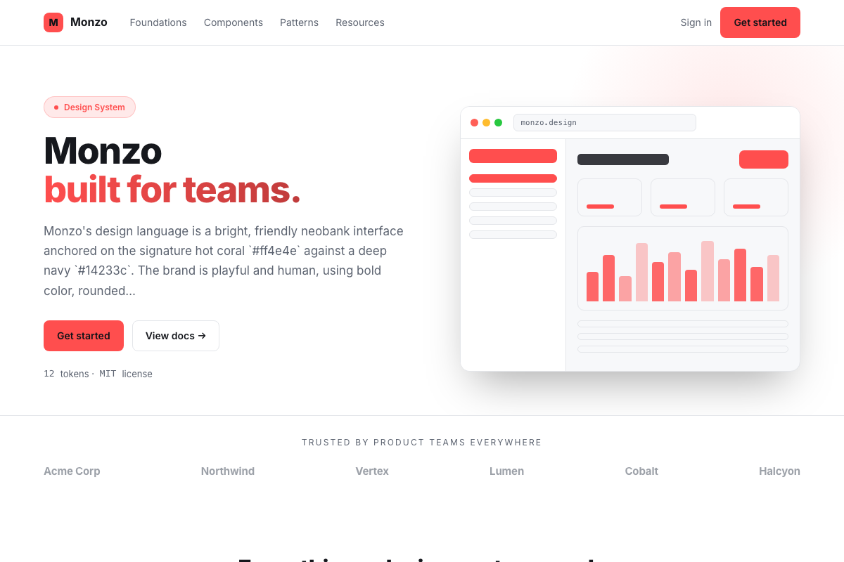
description: Monzo's design language is a bright, friendly neobank interface anchored on the signature hot coral `#ff4e4e` against a deep navy `#14233c`. The brand is playful and human, using bold color, rounded shapes, and clear, conversational typography. Cards are the centerpiece — the coral debit card is an icon — and the interface pairs navy structure with coral moments of delight.

colors:
  primary: "#ff4e4e"
  primary_dark: "#e63b3b"
  primary_light: "#ff6b6b"
  navy: "#14233c"
  navy_soft: "#1f3b5c"
  teal: "#145d76"
  canvas: "#ffffff"
  surface: "#f7f8fa"
  surface_2: "#eef0f3"
  fg_default: "#14233c"
  fg_muted: "#6b7280"
  border_default: "#e5e7eb"
  success: "#0ba360"
  on_primary: "#ffffff"
  on_navy: "#ffffff"

typography:
  display-xxl:
    fontFamily: ""Maison Neue", -apple-system, system-ui, sans-serif"
    fontSize: 56px
    fontWeight: 700
    lineHeight: 1.05
    letterSpacing: -1px
  display-xl:
    fontFamily: ""Maison Neue", -apple-system, system-ui, sans-serif"
    fontSize: 48px
    fontWeight: 700
    lineHeight: 1.1
    letterSpacing: -0.75px
  display-lg:
    fontFamily: ""Maison Neue", -apple-system, system-ui, sans-serif"
    fontSize: 40px
    fontWeight: 600
    lineHeight: 1.1
    letterSpacing: -0.5px
  display-md:
    fontFamily: ""Maison Neue", -apple-system, system-ui, sans-serif"
    fontSize: 32px
    fontWeight: 600
    lineHeight: 1.15
    letterSpacing: -0.25px
  heading-lg:
    fontFamily: ""Maison Neue", -apple-system, system-ui, sans-serif"
    fontSize: 24px
    fontWeight: 600
    lineHeight: 1.2
    letterSpacing: 0
  heading-md:
    fontFamily: ""Maison Neue", -apple-system, system-ui, sans-serif"
    fontSize: 20px
    fontWeight: 600
    lineHeight: 1.3
    letterSpacing: 0
  heading-sm:
    fontFamily: ""Maison Neue", -apple-system, system-ui, sans-serif"
    fontSize: 18px
    fontWeight: 600
    lineHeight: 1.4
    letterSpacing: 0
  body-lg:
    fontFamily: ""Maison Neue", -apple-system, system-ui, sans-serif"
    fontSize: 16px
    fontWeight: 400
    lineHeight: 1.5
    letterSpacing: 0
  body-md:
    fontFamily: ""Maison Neue", -apple-system, system-ui, sans-serif"
    fontSize: 15px
    fontWeight: 400
    lineHeight: 1.5
    letterSpacing: 0
  body-sm:
    fontFamily: ""Maison Neue", -apple-system, system-ui, sans-serif"
    fontSize: 14px
    fontWeight: 400
    lineHeight: 1.4
    letterSpacing: 0
  caption:
    fontFamily: ""Maison Neue", -apple-system, system-ui, sans-serif"
    fontSize: 12px
    fontWeight: 400
    lineHeight: 1.4
    letterSpacing: 0
---

# Design System Inspired by Monzo

## 1. Visual Theme & Atmosphere

Monzo is a bank that feels like a consumer app: bright, friendly, and a little playful. The hot coral `#ff4e4e` (the color of the famous debit card) is the emotional center, set against a deep navy `#14233c` for structure and white for the everyday canvas. The tone is human, transparent, and optimistic — banking without the suit.

## 2. Color System

- **Hot coral** `#ff4e4e` — the card, the logo, primary buttons, and moments of delight.
- **Navy** `#14233c` — headers, dark hero sections, and the app's dark theme.
- A supporting teal `#145d76` for secondary accents and illustrations.
- Light neutrals `#ffffff` / `#f7f8fa` / `#eef0f3` with hairlines `#e5e7eb`; text `#14233c`, muted `#6b7280`.

## 3. Typography

Maison Neue (system fallback) with a clean, conversational tone. Headlines are bold and friendly; body 16px/1.5. The copywriting itself is a brand asset — Monzo writes like a friend, and the type supports that with approachable weights and spacing.

## 4. Components & Shape

The debit card is the hero component: a coral rounded rectangle with the logo, rendered as a reusable card pattern throughout the app. Buttons are full-radius pills. Transaction rows use large, recognizable category icons on colored circular backgrounds. The app is dark-navied with bright, high-contrast content areas.

## 5. Layout & Spacing

A mobile-first single-column app layout with a bottom tab bar; marketing pages are full-bleed and colorful. Spacing is generous (16-24px) and consistent, keeping a friendly, uncrowded feel even in dense transaction lists.

## 6. Motion

Playful and tactile: cards tilt slightly, transaction icons pop in, and the coral CTA pulses softly on hover. Motion is used to add warmth and reinforce feedback, always quick (200-300ms).