设计规范v1.0.0
后台管理面板外壳
内部工具、后台仪表盘和 CMS 管理系统。
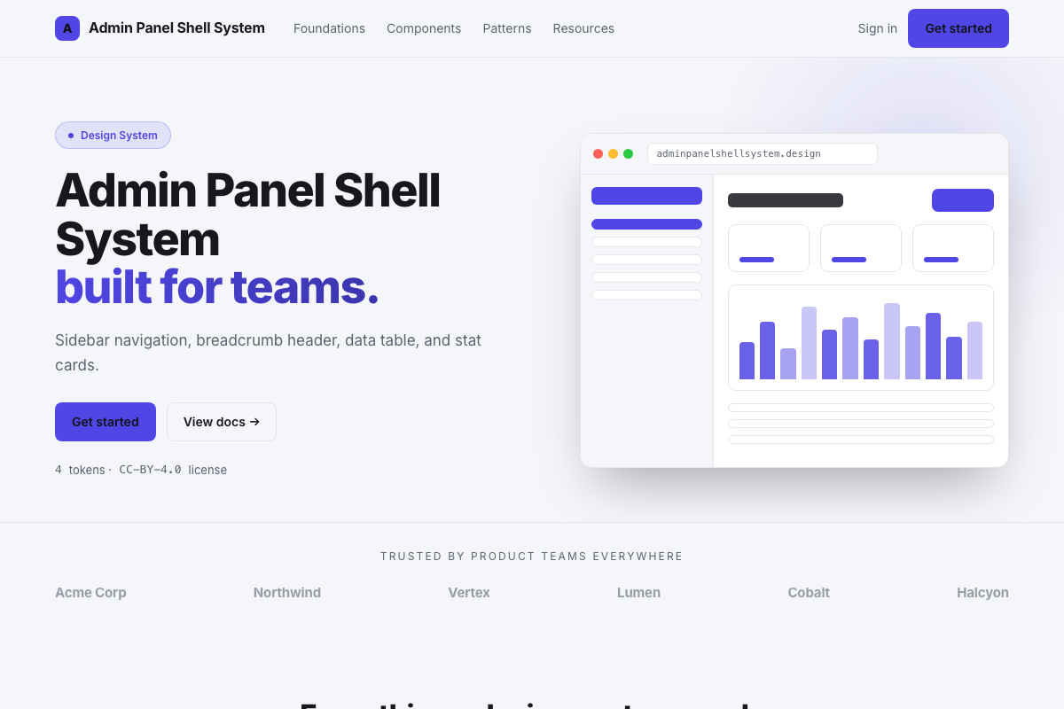
DESIGN.md
---
name: Admin Panel Shell
colors:
  background: '#f5f6fa'
  sidebar: '#1e1e2f'
  surface: '#ffffff'
  primary: '#4f46e5'
  text-primary: '#1e1e2f'
  text-secondary: '#6b7280'
  border: '#e4e4ef'
  success: '#059669'
  warning: '#d97706'
typography:
  heading:
    fontFamily: Inter
    fontSize: 24px
    fontWeight: '600'
  body:
    fontFamily: Inter
    fontSize: 14px
  label:
    fontFamily: Inter
    fontSize: 12px
    fontWeight: '500'
    letterSpacing: '0.05em'
rounded:
  DEFAULT: 8px
spacing:
  base: 4px
---

## Overview

Classic admin layout: dark sidebar with icon+label nav items,
light workspace area with breadcrumb header, stat card row,
and a full-width data table below. Designed for information
density without feeling cluttered.

## Colors

- Background: cool gray (#f5f6fa)
- Sidebar: dark indigo (#1e1e2f) with white/gray text
- Cards: white surface, thin border
- Primary: indigo (#4f46e5) for active states and CTAs

## Typography

Inter throughout. Compact 14px body for table cells, 12px labels
with letter-spacing for column headers and stat labels.

## Components

- Sidebar: 260px fixed, collapsible on smaller screens
- Breadcrumb: slash-separated, last item bold
- Stat Card: label above, large value, optional trend arrow
- Data Table: sticky header, striped rows, sort indicators
- Page Header: breadcrumb + page title + primary action button