Design Specv1.0.0
Startup Launch Kit
Launching a new product, SaaS beta, or startup landing page.
DESIGN.md
---
name: Startup Launch Kit
colors:
  background: '#ffffff'
  surface: '#f9fafb'
  primary: '#7c3aed'
  primary-gradient: 'linear-gradient(135deg, #7c3aed, #3b82f6)'
  text-primary: '#111827'
  text-secondary: '#6b7280'
  border: '#e5e7eb'
  accent: '#f59e0b'
typography:
  hero-heading:
    fontFamily: Inter
    fontSize: 56px
    fontWeight: '800'
    lineHeight: '1.05'
    letterSpacing: '-0.03em'
  heading:
    fontFamily: Inter
    fontSize: 32px
    fontWeight: '700'
  body:
    fontFamily: Inter
    fontSize: 18px
    lineHeight: '1.7'
  label:
    fontFamily: Inter
    fontSize: 14px
    fontWeight: '600'
    letterSpacing: '0.05em'
rounded:
  DEFAULT: 12px
  button: 9999px
spacing:
  base: 4px
---

## Overview

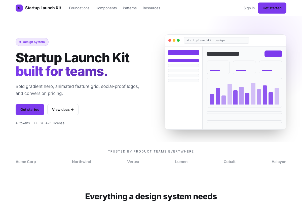
Bold, confident, conversion-optimized. A purple-to-blue gradient
hero commands attention. Generous whitespace, large typography,
and rounded-everything create a modern SaaS feel. Feature sections
use animated card grids with icon bursts; pricing has a clear
highlighted tier.

## Colors

- Background: white — clean canvas for vibrant accents
- Primary: vivid violet (#7c3aed) with a blue gradient companion
- Accent: warm amber (#f59e0b) for CTAs and highlights
- Text: near-black (#111827) for maximum contrast

## Typography

Inter at 800 weight, 56px, tight line-height for hero headlines
— maximum impact. 32px section headings, 18px body for
readability. All labels uppercase with letter-spacing.

## Components

- Gradient Hero: full-viewport, animated gradient bg, centered CTA
- Feature Grid: 3-column, icon+title+desc cards with hover lift
- Logo Bar: grayscale client logos, colored on hover
- Pricing Table: 3 tiers, center column highlighted with purple border
- FAQ Accordion: bordered sections, chevron toggle, smooth expand
- CTA Banner: gradient strip before footer, single big button