Design Specv1.0.0
Soft Corporate UI System
Enterprise SaaS, internal tools, B2B dashboards, and any product that needs to feel trustworthy.
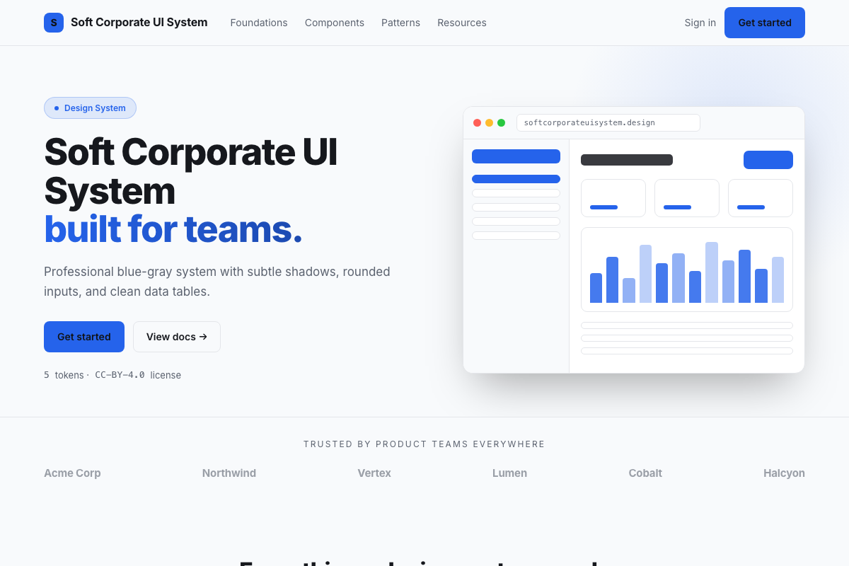
DESIGN.md
---
name: Soft Corporate UI
colors:
  background: '#f8fafc'
  surface: '#ffffff'
  primary: '#2563eb'
  primary-hover: '#1d4ed8'
  text-primary: '#0f172a'
  text-secondary: '#475569'
  border: '#e2e8f0'
  muted: '#f1f5f9'
  success: '#059669'
  warning: '#d97706'
  error: '#dc2626'
typography:
  heading:
    fontFamily: Inter
    fontSize: 24px
    fontWeight: '600'
  body:
    fontFamily: Inter
    fontSize: 14px
    lineHeight: '1.6'
  label:
    fontFamily: Inter
    fontSize: 12px
    fontWeight: '500'
    letterSpacing: '0.04em'
rounded:
  DEFAULT: 6px
  input: 8px
  card: 10px
spacing:
  base: 4px
---

## Overview

Professional, trustworthy, and understated. A blue-gray palette
rooted in corporate SaaS conventions — royal blue primary, slate
text, cool gray backgrounds. Soft shadows (0-2px blur) convey
depth without drama. This is the design system you use when the
product needs to feel reliable, not flashy.

## Colors

- Background: cool slate (#f8fafc) — clean but not sterile
- Surface: white cards on the cool background
- Primary: royal blue (#2563eb) — familiar, trustworthy
- Semantic: green success, amber warning, red error
- Borders: light slate (#e2e8f0), subtle but present

## Typography

Inter at three weights: 600 for headings, 400 for body, 500
for labels. Compact 14px body keeps data-dense screens readable.
12px labels with letter-spacing for form labels and column headers.

## Components

- Button: primary fill with 6px radius, 1px shadow, hover darkens
- Input: white well, 8px radius, blue focus ring, subtle inner shadow
- Card: white surface, 10px radius, 1px border, soft shadow
- Data Table: striped rows, sticky header, sortable column indicators
- Badge: rounded pill, tinted background, matching text color
- Modal: centered overlay, backdrop blur, slide-up entrance