Design Specv1.0
Robinhood
Apply Robinhood's design language to your project for a polished, brand-consistent UI.
DESIGN.md
Apply Robinhood's design language to your project for a polished, brand-consistent UI.
---
version: alpha
name: Robinhood-design-analysis
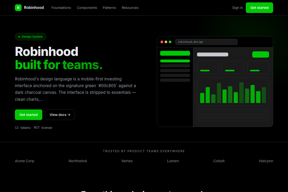
description: Robinhood's design language is a mobile-first investing interface anchored on the signature green `#00c805` against a dark charcoal canvas. The interface is stripped to essentials — clean charts, large type, and a single green for up/positive states (paired with red for down). The tone is approachable, modern, and deliberately free of financial-industry clutter.

colors:
  primary: "#00c805"
  primary_dark: "#00a305"
  up: "#00c805"
  down: "#f45531"
  canvas: "#000000"
  surface: "#1a1a1a"
  surface_2: "#161616"
  surface_3: "#242424"
  fg_default: "#f0f0f0"
  fg_muted: "#6b6b6b"
  fg_faint: "#404040"
  border_default: "#2a2a2a"
  accent_blue: "#007aff"
  on_primary: "#000000"
  on_primary_dark: "#ffffff"

typography:
  display-xxl:
    fontFamily: ""Graphik", -apple-system, system-ui, sans-serif"
    fontSize: 56px
    fontWeight: 700
    lineHeight: 1.05
    letterSpacing: -1px
  display-xl:
    fontFamily: ""Graphik", -apple-system, system-ui, sans-serif"
    fontSize: 48px
    fontWeight: 700
    lineHeight: 1.1
    letterSpacing: -0.75px
  display-lg:
    fontFamily: ""Graphik", -apple-system, system-ui, sans-serif"
    fontSize: 40px
    fontWeight: 600
    lineHeight: 1.1
    letterSpacing: -0.5px
  display-md:
    fontFamily: ""Graphik", -apple-system, system-ui, sans-serif"
    fontSize: 32px
    fontWeight: 600
    lineHeight: 1.15
    letterSpacing: -0.25px
  heading-lg:
    fontFamily: ""Graphik", -apple-system, system-ui, sans-serif"
    fontSize: 24px
    fontWeight: 600
    lineHeight: 1.2
    letterSpacing: 0
  heading-md:
    fontFamily: ""Graphik", -apple-system, system-ui, sans-serif"
    fontSize: 20px
    fontWeight: 600
    lineHeight: 1.3
    letterSpacing: 0
  heading-sm:
    fontFamily: ""Graphik", -apple-system, system-ui, sans-serif"
    fontSize: 18px
    fontWeight: 600
    lineHeight: 1.4
    letterSpacing: 0
  body-lg:
    fontFamily: ""Graphik", -apple-system, system-ui, sans-serif"
    fontSize: 16px
    fontWeight: 400
    lineHeight: 1.5
    letterSpacing: 0
  body-md:
    fontFamily: ""Graphik", -apple-system, system-ui, sans-serif"
    fontSize: 15px
    fontWeight: 400
    lineHeight: 1.5
    letterSpacing: 0
  body-sm:
    fontFamily: ""Graphik", -apple-system, system-ui, sans-serif"
    fontSize: 14px
    fontWeight: 400
    lineHeight: 1.4
    letterSpacing: 0
  caption:
    fontFamily: ""Graphik", -apple-system, system-ui, sans-serif"
    fontSize: 12px
    fontWeight: 400
    lineHeight: 1.4
    letterSpacing: 0
---

# Design System Inspired by Robinhood

## 1. Visual Theme & Atmosphere

Robinhood stripped the investing interface down to its essence: a near-black `#000000` canvas, large friendly type, and a single green `#00c805` that means "up, buy, go." The dark mode is the default and the signature, giving charts and numbers a glowing, focused feel. The tone is approachable and modern, explicitly rejecting the dense, intimidating look of legacy finance.

## 2. Color System

- **Robinhood green** `#00c805` — up states, buy buttons, positive movement.
- **Down red** `#f45531` — sell, negative movement, destructive actions.
- Surfaces step through `#000000`, `#161616`, `#1a1a1a`, `#242424` with hairlines `#2a2a2a`.
- Text is `#f0f0f0` with muted `#6b6b6b` and faint `#404040` for secondary data.
- A single blue `#007aff` appears for links and informational accents.

## 3. Typography

Graphik (system fallback) with a friendly, geometric character. Numbers and prices are large and bold — the ticker is the hero. Body 16px/1.5; the tone is confident and human, never bureaucratic.

## 4. Components & Shape

The signature component is the clean line chart with a subtle gradient fill; the "buy/sell" button is a full-width rounded pill, green or red depending on direction. Cards are dark, softly elevated panels with 12px radii. Bottom-sheet navigation (mobile-first) is a hallmark, and stock lists use large touch targets.

## 5. Layout & Spacing

A mobile-first single column that expands to a centered two-pane layout (list + detail) on desktop. The bottom tab bar is persistent on mobile. Spacing is generous (16-24px) to keep the dense financial data from feeling overwhelming.

## 6. Motion

Numbers tick up/down with color flashes, charts animate smoothly on interaction, and sheets slide in from the bottom. Motion is polished and reactive, making market movement feel alive.